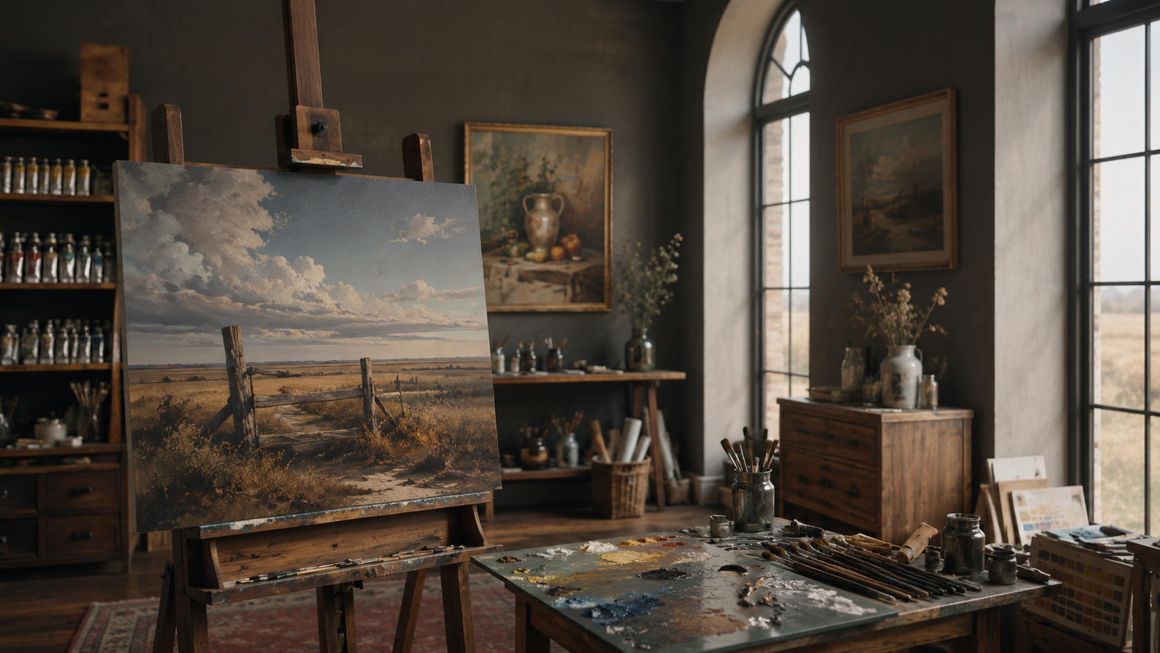
A meticulously arranged oil painter’s worktable in a quiet studio, featuring a heavy wooden palette stained with overlapping layers of dried color, wet piles of cadmium red, ultramarine, and yellow ochre freshly placed along the edge. Several well-used natural bristle brushes lie nearby, their tips glistening with paint, resting on a folded linen rag stained in subtle earth tones. In the background, a large primed canvas waits on an easel, softly blurred. Gentle north-facing window light bathes the scene, creating delicate specular highlights on the oily paint and soft shadows beneath the tools. Photographic realism, eye-level composition, shallow depth of field, and a calm, sophisticated atmosphere emphasize the seriousness and craft of traditional oil painting.

Oil Painting Tools & Tutorials for Artists

A heavy, oval-shaped wooden palette dominates the foreground, its surface curated with deliberate color strings transitioning smoothly from pure pigment to subtle neutralized tones. Each dab of oil paint has a velvety, buttery sheen, reflecting tiny points of warm studio light. Beneath the palette lies a slate-grey tabletop with a single, pristine palette knife resting diagonally, its metal blade catching a sharp highlight along the edge. The background reveals an out-of-focus arrangement of glass jars filled with linseed oil, turpentine, and refined mediums on a dark walnut shelf. Dramatic, cinematic side lighting from an unseen lamp creates a chiaroscuro effect, emphasizing the tactile richness of the paint. Shot from a slightly elevated angle with the palette centered but framed by negative space, the composition feels controlled, intentional, and quietly luxurious, evoking the mindset of a master color mixer.
A close-up view of a meticulously organized color chart on heavy, deckled-edge paper, each square painted with oil mixtures ranging from vibrant complementary contrasts to perfectly calibrated greys. Handwritten pigment names and ratios in crisp, dark ink line the margins, adding a scholarly precision. The chart rests on a deep, espresso-colored drafting table, with an antique brass desk lamp arcing overhead. The lamp casts a warm, focused pool of light that reveals the subtle gloss of drying oil and the paper’s toothy texture, while the surrounding studio falls into soft shadow. Captured from a slightly oblique, cinematic angle, the frame uses the rule of thirds, letting the chart dominate while blurred glass bottles and an old wooden color wheel sit in the background. The mood is intellectual, refined, and quietly obsessive about color accuracy.
An immaculate porcelain mixing tile, pure white with softly beveled edges, is laid on a dark, matte stone countertop. Across its surface, three disciplined color pathways radiate outward: a blue-to-orange neutral scale, a red-to-green harmony, and a yellow-to-violet sequence, each rendered in smooth, creamy oil transitions with no visible brush marks. A single, slender, long-handled brush with a polished black ferrule rests beside the tile, its bristles tipped with a perfectly mixed neutral grey. Overhead, cool, diffused daylight from a north-facing window bathes the scene, ensuring flawless color fidelity, while a subtle rim of reflected light defines the tile’s edge. Filmed in a cinematic, overhead top-down composition with crisp focus and a minimalist aesthetic, the atmosphere feels clinical yet luxurious—an elegant laboratory for mastering color mixing without guesswork.
A polished mahogany workbench displays an open, leather-bound color notebook beside a segmented wooden box of premium oil paint tubes, arranged by temperature from coolest blues to warmest reds. On the notebook page, carefully painted oil swatches step through controlled value shifts of a single hue, annotated with precise medium ratios. A small, circular glass palette nearby holds nuanced, pre-mixed skin-tone neutrals, each mound of paint with a soft, satiny gleam. Cool, indirect studio lighting from overhead panels creates even illumination with gentle, cinematic falloff at the frame’s edges, preserving subtle color relationships without harsh shadows. Shot at a three-quarter angle with the notebook placed along the lower third, the depth of field keeps every note and swatch legible while the background—shelves of archived sketchbooks and color wheels—softly blurs. The mood is scholarly, disciplined, and unmistakably sophisticated, celebrating methodical color study.

About

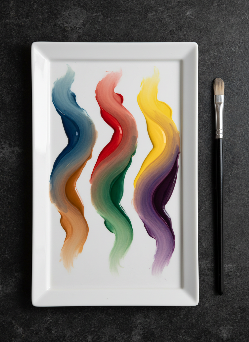
The Oil Painter’s Studio teaches practical color mixing for every level, using clear demonstrations, limited palettes, and repeatable methods so you can paint confidently without wasting paint, time, or inspiration on muddy guesses.

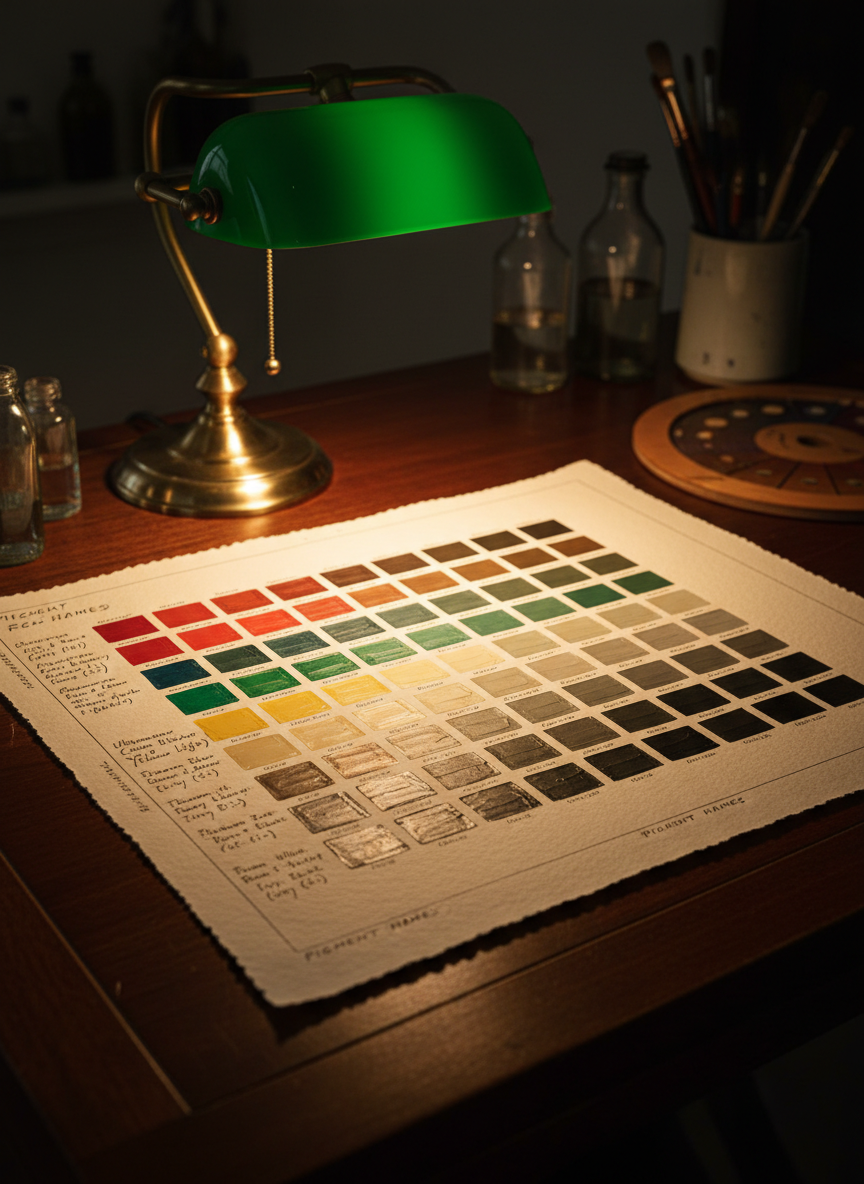
Fresh lessons on color, value, and edges.

Learn oil painting

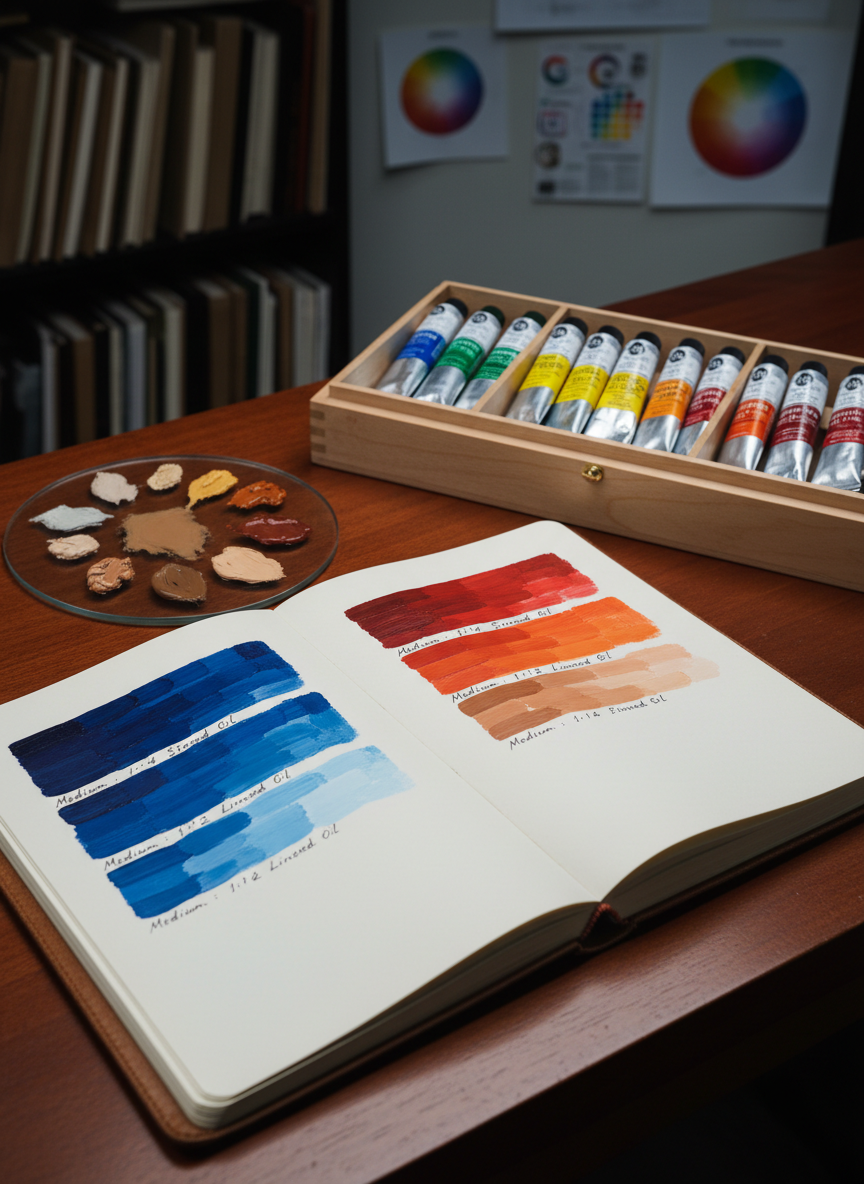
Explore guided oil-painting paths, from foundational color theory and palette setup to advanced skin tones and landscape atmospheres, all broken into clear, repeatable steps you can practice in your own studio.

About

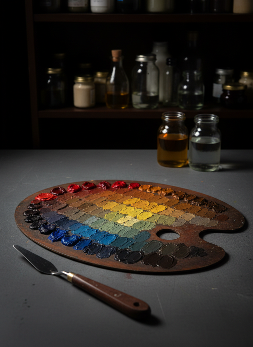
Color mixing made wonderfully predictable

Stop fighting your paints and start using simple, proven mixing frameworks that let you build any color family—from luminous skin to moody skies—without cluttered palettes or confusing theory.

A heavy, oval-shaped wooden palette dominates the foreground, its surface curated with deliberate color strings transitioning smoothly from pure pigment to subtle neutralized tones. Each dab of oil paint has a velvety, buttery sheen, reflecting tiny points of warm studio light. Beneath the palette lies a slate-grey tabletop with a single, pristine palette knife resting diagonally, its metal blade catching a sharp highlight along the edge. The background reveals an out-of-focus arrangement of glass jars filled with linseed oil, turpentine, and refined mediums on a dark walnut shelf. Dramatic, cinematic side lighting from an unseen lamp creates a chiaroscuro effect, emphasizing the tactile richness of the paint. Shot from a slightly elevated angle with the palette centered but framed by negative space, the composition feels controlled, intentional, and quietly luxurious, evoking the mindset of a master color mixer.

Subscribe

Get weekly color charts, tips, and prompts.

Contact studio

Ask a question about courses, materials, or color problems, and we’ll respond with tailored guidance for your painting practice.

← Back

Thank you for your response. ✨

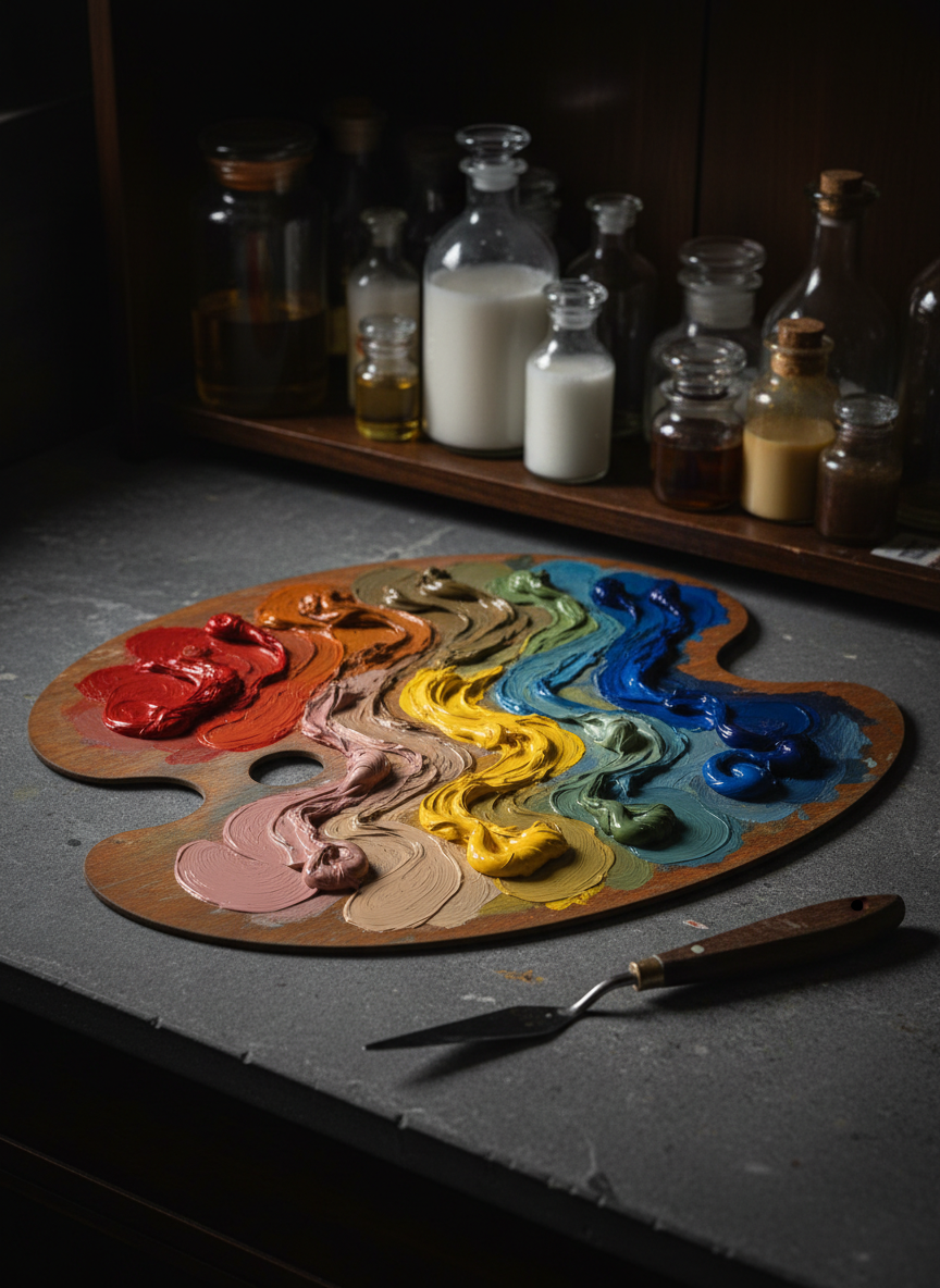
Studio-Tested Art Supplies

Below are trusted palettes, brushes, mediums, and studio accessories I personally use for reliable color mixing. Some links are affiliate links, which means I may earn a small commission at no extra cost to you.

A heavy, oval-shaped wooden palette dominates the foreground, its surface curated with deliberate color strings transitioning smoothly from pure pigment to subtle neutralized tones. Each dab of oil paint has a velvety, buttery sheen, reflecting tiny points of warm studio light. Beneath the palette lies a slate-grey tabletop with a single, pristine palette knife resting diagonally, its metal blade catching a sharp highlight along the edge. The background reveals an out-of-focus arrangement of glass jars filled with linseed oil, turpentine, and refined mediums on a dark walnut shelf. Dramatic, cinematic side lighting from an unseen lamp creates a chiaroscuro effect, emphasizing the tactile richness of the paint. Shot from a slightly elevated angle with the palette centered but framed by negative space, the composition feels controlled, intentional, and quietly luxurious, evoking the mindset of a master color mixer.